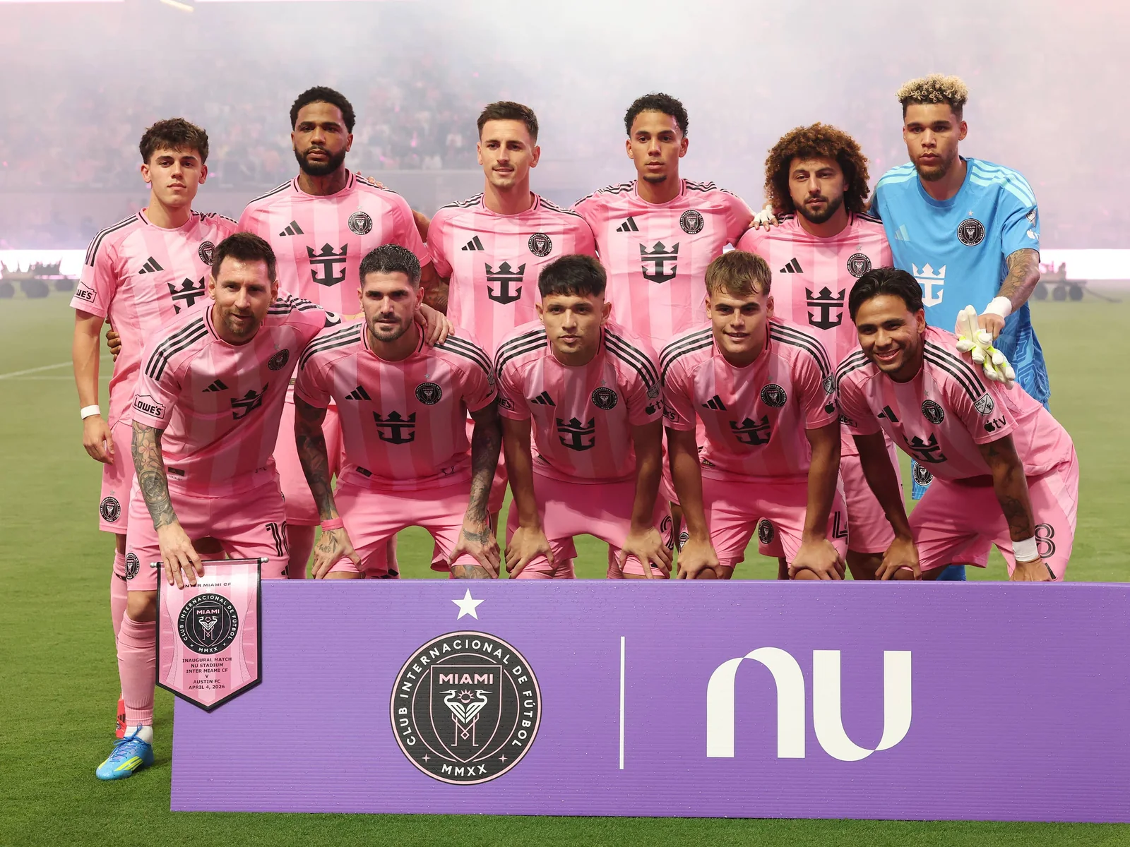
Thirty MLS clubs play in 2026, and their badges carry far more information than a city name on a schedule. A heron, loon, tree, axe, crown or bold initial can identify a team before the camera shows the scoreboard. This guide gives a quick visual cue for every current Eastern and Western Conference crest, then explains a few marks fans commonly confuse.
The images beside the club entries show current primary badges. A match shirt may use a one-color version of the same design, and a club may also sell retro or commemorative merchandise. Read the description alongside the crest to recognize the underlying shape and central symbol even when its colors change on a particular kit.
How to read an MLS club badge
Start with the outline. Is it a circle, a traditional shield, a pennant or an unusual custom shape? Then look for the largest element: an animal, landmark, tool, letter or star. Finally, read the small text around the border. This sequence works better than memorizing jersey colors. Clubs unveil new home and away shirts, and an away shirt may shift the crest to a single color for contrast, but the main form usually remains recognizable.
For example, Inter Miami's round badge is identifiable by two facing birds even on a black shirt, while Atlanta United's round badge centers a large A against stripes. Both can appear dark at a glance, yet their centers are entirely different. In the West, an axe points toward Portland, a loon toward Minnesota and the Space Needle toward Seattle. These are identification cues, not a claim that every design detail has an officially stated hidden meaning.
The club list and conference placement here match MLS's published 2026 competition guidelines. For geography and state-by-state sorting, use the existing MLS teams map. This article stays with what you see on badges, kits and match graphics. When a crest has an alternate historical design, the 2026 primary badge takes priority in the entries below.
Eastern Conference: 15 crests and their clearest visual cues
The East has an unusually wide mix of circles and shields. Look first at the central icon: several badges are recognizable from an animal or civic emblem, while others rely on an oversized letter. The short descriptions below refer to the 2026 primary marks shown beside them.
Animals and civic emblems
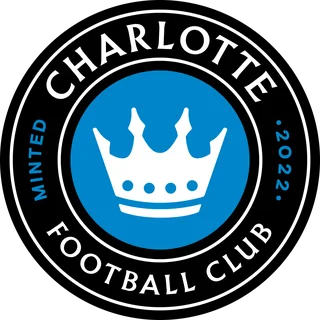 Charlotte FC. A white crown sits in the middle of a vivid blue circle, enclosed by a broad black outer ring carrying the club name. The crown is the fastest identifier when the badge is reduced to a small score graphic. Do not confuse the blue center with New York City FC: Charlotte has a crown, while NYCFC has interlocking letters.
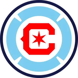 Chicago Fire FC. This round mark combines a red C around a six-pointed red star, with pale blue and white shapes inside a dark outer ring. At a glance, its red-and-blue palette may resemble another Eastern club, so the central star and segmented C matter more than the colors alone. Older Chicago crest pictures can look quite different.
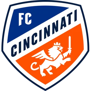 FC Cincinnati. The blue-and-orange shield uses a slanted name band and a white crowned, winged lion holding a sword. Its diagonal layout immediately separates it from Orlando City's straight-edged purple lion shield. When the badge is tiny, look for orange across the lower half and the word “Cincinnati” cutting across the middle.
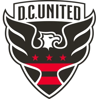 D.C. United. A large eagle spreads across a black, white and red shield below the D.C. UNITED name bar. Three red stars sit underneath the bird. The eagle's broad wings create a very different silhouette from the small, paired herons in Inter Miami's circle. The older red-and-black visual identity is still evident, even when a kit changes its background color.
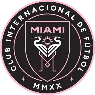 Inter Miami CF. Two facing white herons and a pink sunlike circle occupy a black roundel edged in pink. The long Spanish club name runs around the outside, with MMXX at the bottom. At a distance, the pale birds are easier to spot than the small letters. Pink and black clothing reinforces the identification, but the bird pair is the definitive cue.
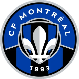 CF Montréal. A white and grey fleur-de-lis overlays blue-and-black vertical stripes within a round badge. The club name arcs above, with 1993 below. A fleur-de-lis can appear elsewhere in Quebec-themed design, but the combination of that central form and narrow dark stripes identifies the MLS club mark. Check for this round version when looking through older Montréal logo archives.
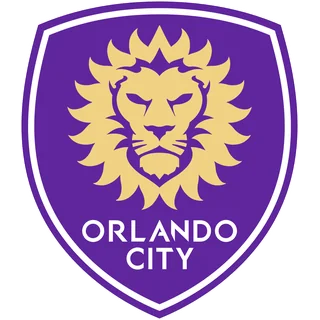 Orlando City SC. The gold lion's head fills a tall purple shield, with ORLANDO CITY set in white near the base. The mane creates rays around the face and is legible even when a broadcast shrinks the crest. If you see a lion but the shield is blue and orange with a sword, you have found FC Cincinnati instead.
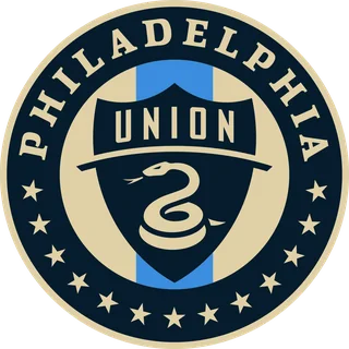 Philadelphia Union. The central shield contains a coiled gold snake beneath a UNION banner, all set inside a navy-and-gold circle with stars around its lower ring. The snake is the useful detail on a larger scarf or shirt; on a small scoreboard, look for the navy circle, gold edge and inner shield. It is one of the East's most layered badges.
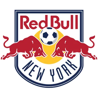 Red Bull New York. Two red bulls face one another in front of a yellow disc, under the familiar Red Bull wordmark and above NEW YORK. The mark is a white shield rather than NYCFC's pale blue circle. Many logo galleries list this club under “New York Red Bulls”; MLS's 2026 competition list uses “Red Bull New York,” and the charging bulls make either label easy to recognize.
Letters, flags and geometric marks
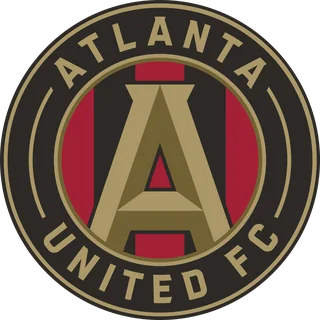 Atlanta United. A bold gold A dominates a black ring, with red-and-black vertical stripes visible behind it. Small gold lettering circles the outside. The stripes and central A make the badge legible without reading every word; the club's “Five Stripes” nickname is also a useful memory aid when you see a kit or supporter flag.
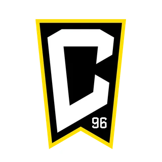 Columbus Crew. A large white C sits on a black pennant shape edged in yellow, with a small 96 near the lower right. The compact mark works without a written club name: its pointed lower notch makes the silhouette unlike the East's many circles. If a search result shows construction workers in a round shield, it is displaying an older Columbus mark.
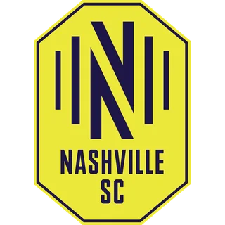 Nashville SC. The bright yellow, eight-sided outline encloses a large navy N built from thick bars. NASHVILLE and SC sit below the letter. Yellow is strong on the club's shirts too, but the octagonal frame is the better badge clue. Few other MLS primary crests have this angular, almost stop-sign-like outline.
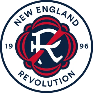 New England Revolution. The current circle contains a large stylized white R with a red diagonal stroke and curved red-and-navy shapes. NEW ENGLAND REVOLUTION runs around the outer ring. This is easy to miss if you learned the club from its former paintbrush-flag mark, which still appears in old search images and retro merchandise.
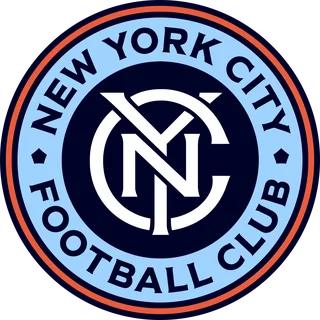 New York City FC. Interlocking white NYC letters fill a navy center, surrounded by an orange ring and a larger pale blue ring bearing the full club name. The orange inner border is a particularly good cue when the crest appears at small size. Unlike its New York rival, this badge has neither charging bulls nor a yellow disc.
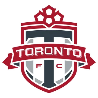 Toronto FC. TORONTO stretches across a red horizontal bar above a large dark T on the white lower field. Smaller F and C letters sit on either side of the T. The compact red shield is easier to recognize from the central lettering than from its tiny top details. Toronto is one of MLS's Canadian clubs, but its badge works as a simple lettermark.
Western Conference: 15 crests and their clearest visual cues
Western Conference marks include some of MLS's strongest nature imagery, but not every badge tells its story with a picture. A few use initials and custom geometry instead. The images below are the 2026 primary crests, arranged by the feature most useful to a viewer rather than by city or state.
Landscapes, wildlife and local landmarks
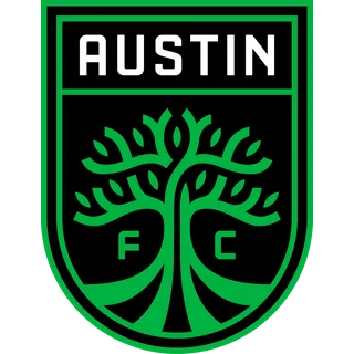 Austin FC. A branching green tree fills a tall black shield, with AUSTIN across the top and small F and C letters beside the trunk. The bright green against black is distinctive, but the tree is the detail to remember if the badge is shown in a single color. Its organic branches contrast with Houston's nearby angular orange monogram.
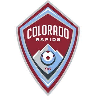 Colorado Rapids. Burgundy frames a mountain scene, a soccer ball and a small 96 in a tall shield. The word COLORADO arches across the top, with RAPIDS below. Vancouver also uses mountain imagery, but the Rapids place it in a burgundy shield with a ball; Vancouver's mountain is a broad white form in a diamond.
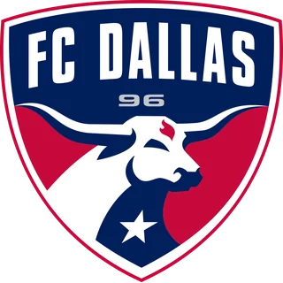 FC Dallas. A large white longhorn fills the lower portion of a red-and-navy shield. FC DALLAS is set high above it, with a small 96 and star in the design. The long horns create an unmistakable horizontal line, especially on a shirt. This is the West's clearest animal face, unlike Minnesota's full-bird silhouette.
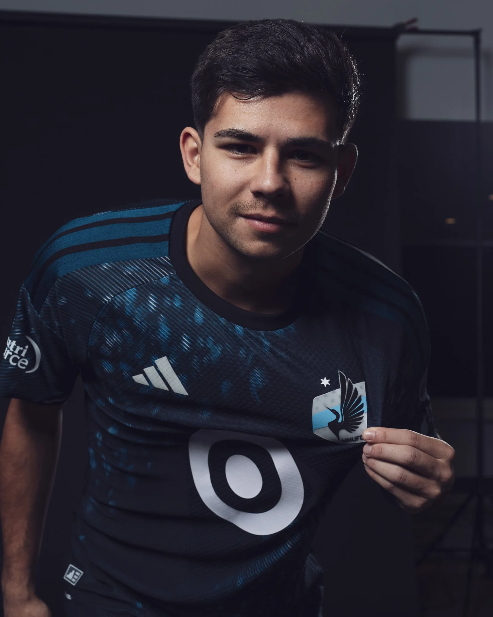
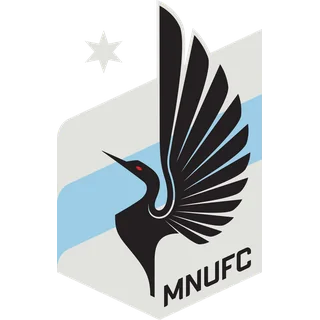 Minnesota United FC. A black loon stands across a narrow grey crest, crossed by a pale blue diagonal stripe. MNUFC appears near the lower edge and a small star sits above. On an actual kit, the bird's long neck and wings are more useful than the initials. This is a different type of avian image from D.C. United's eagle and Inter Miami's paired herons.
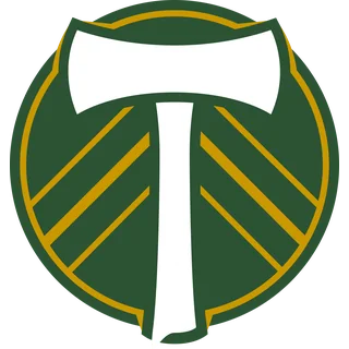 Portland Timbers. A white axe stands upright inside a dark green roundel, with gold lines fanning diagonally on either side. The broad axe head is visible even at small sizes. Portland's green can resemble Austin's, but a circle and tool signal the Timbers; Austin uses a shield and tree.
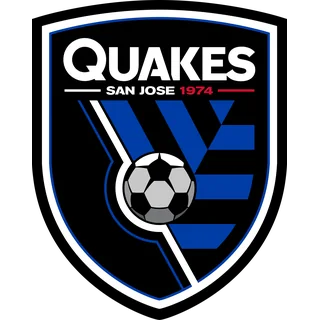 San Jose Earthquakes. QUAKES fills the upper black shield in white, with SAN JOSE and 1974 beneath. Angular blue forms and a soccer ball occupy the lower half. The letters do much of the identification here: a small broadcast mark may make the abstract blue shapes hard to read, but the big QUAKES wordmark remains prominent.
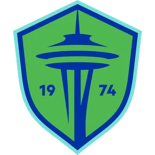 Seattle Sounders FC. The Space Needle rises through the center of a bright green and blue shield, with 19 and 74 flanking the tower. The landmark is the quickest cue even if the small numbers disappear on a scorebug. Seattle's shape has changed from older Sounders marks, so use the tower inside the current shield rather than memorizing an old word banner.
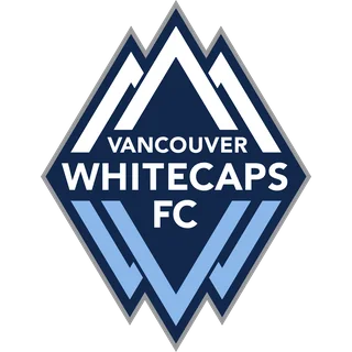 Vancouver Whitecaps FC. A broad white mountain form tops a navy diamond containing stacked VANCOUVER WHITECAPS FC lettering and angular pale blue W shapes. The diamond silhouette distinguishes it from Colorado's burgundy mountain shield. Vancouver is the third Canadian MLS club in this guide, alongside Montréal and Toronto.
Letterforms, stars and heritage symbols
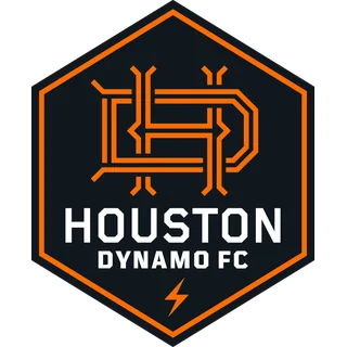 Houston Dynamo FC. A dark hexagon with a thick orange edge encloses angular orange linework above the HOUSTON DYNAMO FC name. A small lightning shape appears near the bottom. The six-sided outline matters as much as the monogram: it prevents confusion with Austin's green tree shield or another orange-accented kit.
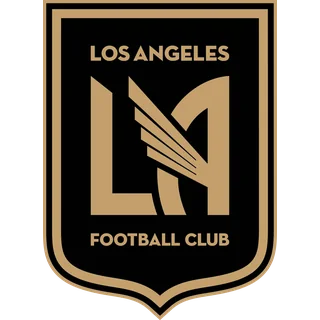 Los Angeles FC. A gold LA monogram cut by a stylized wing fills a black shield, with LOS ANGELES and FOOTBALL CLUB in smaller gold letters. The winged L makes the initials feel diagonal. If you see a gold LA on a black field, it is LAFC; the Galaxy's LA is white on navy beneath a starburst.
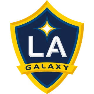 LA Galaxy. Large white LA letters sit below a four-point starburst in a navy-and-gold shield. GALAXY crosses a gold banner at the bottom. The starburst is the fastest recognition cue and helps separate it from LAFC's winged lettermark. Both clubs use gold, so watch the background color and the shape above the initials.
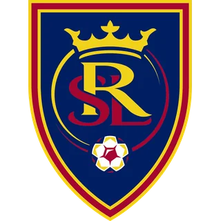 Real Salt Lake. An interlocking RSL monogram dominates a navy shield with red trim and gold edges. A crown sits above the letters, and a small ball below. At match-graphic size, the intertwined letters are much clearer than the ball. This is another crowned mark in MLS, but it is not Charlotte's white crown inside a blue circle.
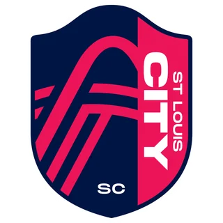 St. Louis CITY SC. A strong pink-red side panel carries the large vertical word CITY, beside smaller vertical ST LOUIS. The rest of the shield is dark navy, with SC near the base. This vertical typography stands out among MLS marks that put city names around a circle or across a horizontal banner. The unusual text arrangement is more dependable than the shirt color.
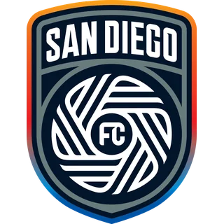 San Diego FC. SAN DIEGO arches over a circular woven-line emblem on a dark shield. The border moves through warm orange and red into purple and blue. Its central white pattern is a useful identifier even when the colored edge is small. San Diego joined MLS before this 2026 guide; search images showing proposed fan marks are not the club's current primary crest.
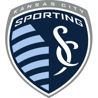 Sporting Kansas City. SPORTING and KANSAS CITY occupy the upper half of a grey/navy shield, while pale blue curved stripes and a large interlocking SC fill the lower half. Look for the split lower field when the name is too small to read. It is a letterform badge, but its layered shield is quite different from Columbus's black pennant or Nashville's yellow octagon.
Common badge mix-ups to avoid
A small score graphic can hide the fine print that makes two clubs easy to separate on a full-size shirt. These three comparisons focus on the feature that survives the shrink. They are especially useful when a broadcast gives both teams monochrome graphics or a new away kit changes the familiar shirt color.
New York City FC and Red Bull New York
Both names contain New York, but the center of each badge solves the problem immediately. NYCFC has interlocking NYC letters inside a pale blue and orange circle. Red Bull New York has two red bulls in front of a yellow disc on a white shield. If the team name is too small to read, ask whether you see letters or animals. The official MLS club page uses “Red Bull New York” in 2026, while some merchandise and logo catalogs still use “New York Red Bulls.” The visual mark is the same one described above.
LA Galaxy and Los Angeles FC
The two Los Angeles clubs both use LA initials and gold accents. Galaxy's white LA sits under a four-point starburst on a navy field, with GALAXY across a lower banner. LAFC's gold LA is sliced by a wing on a black field. In a quick glance, look above the letters for Galaxy's starburst and through the letters for LAFC's wing. A shirt color alone is less helpful because both clubs release new kits over time.
Seattle Sounders and Portland Timbers
Green dominates both Northwest identities, yet the shapes are almost opposites. Seattle uses a tall shield with the Space Needle, which the club's updated crest makes central. Portland uses a dark green circle around a vertical axe. When the logos appear small, the needle reads as a narrow tower while the axe has a broad head. The surrounding green is a regional color cue, but the symbol is the reliable club cue.
Why a 2026 kit may show a different-looking mark
The badge printed or stitched onto a jersey is often adapted to the shirt. A full-color crest shown in a club directory may appear as a white, black or gold one-color mark on an alternate kit. The change can improve contrast against the fabric without changing the underlying club identity. That is why shape and central motif are more dependable than a precise shade when you are trying to identify a team on television.
MLS's 2026 kit releases also make a simple point: a new shirt is not necessarily a new crest. Clubs can add local artwork, change a collar or reveal a fresh away color while retaining their primary mark. The Minnesota photograph above shows how a real crest sits on a particular 2026 jersey; it should be read alongside the plain badge image rather than mistaken for a new logo. Sponsor marks, the adidas logo and league sleeve patches are separate elements on the kit.
Older merchandise adds another source of confusion. Columbus, Chicago, New England and Seattle have all appeared in past logo galleries with substantially different-looking marks from their current ones. A throwback scarf may intentionally revive a historic design. For a 2026 team identification question, check the club's current official page or match graphics first, then use history pages to understand the older mark. If the central symbol has changed but the image date is old, you may be looking at a previous era rather than a new 2026 rebrand.
Where to confirm a current MLS crest
When two search images disagree, start with the official MLS club directory or the club's own current site. Confirm that the club is in the 2026 list, then compare the primary badge with the one used in a current match or official kit announcement. A logo-history page is useful for understanding when an older mark was used, but its archive thumbnail should not overrule a current club page. The 30 images in this guide are intended as a recognition aid for the 2026 primary marks, not a license to use the artwork commercially.
For a fast matchday check, pair the visual cue with the team name on the MLS standings. If you need to know where the club plays, the 2026 teams map answers that different question. If you want to know whether a surprising white or gold version is a rebrand, compare the shape and center of the mark first, then check the date and type of the kit. These steps work even when a tiny crest hides the lettering: herons mean Miami, an axe means Portland, a Space Needle means Seattle and the winged LA belongs to LAFC.
Comments
Comments are reviewed before publication.
Spam, abusive content, personal information and policy-violating links are not published.
Sign in with Google to comment or reply.
Loading comments…